
(FINALS ACTIVITY 1 INTRO TO MMA) PRINCIPLE OF MULTIMEDIA DESIGN BY DOCTORE


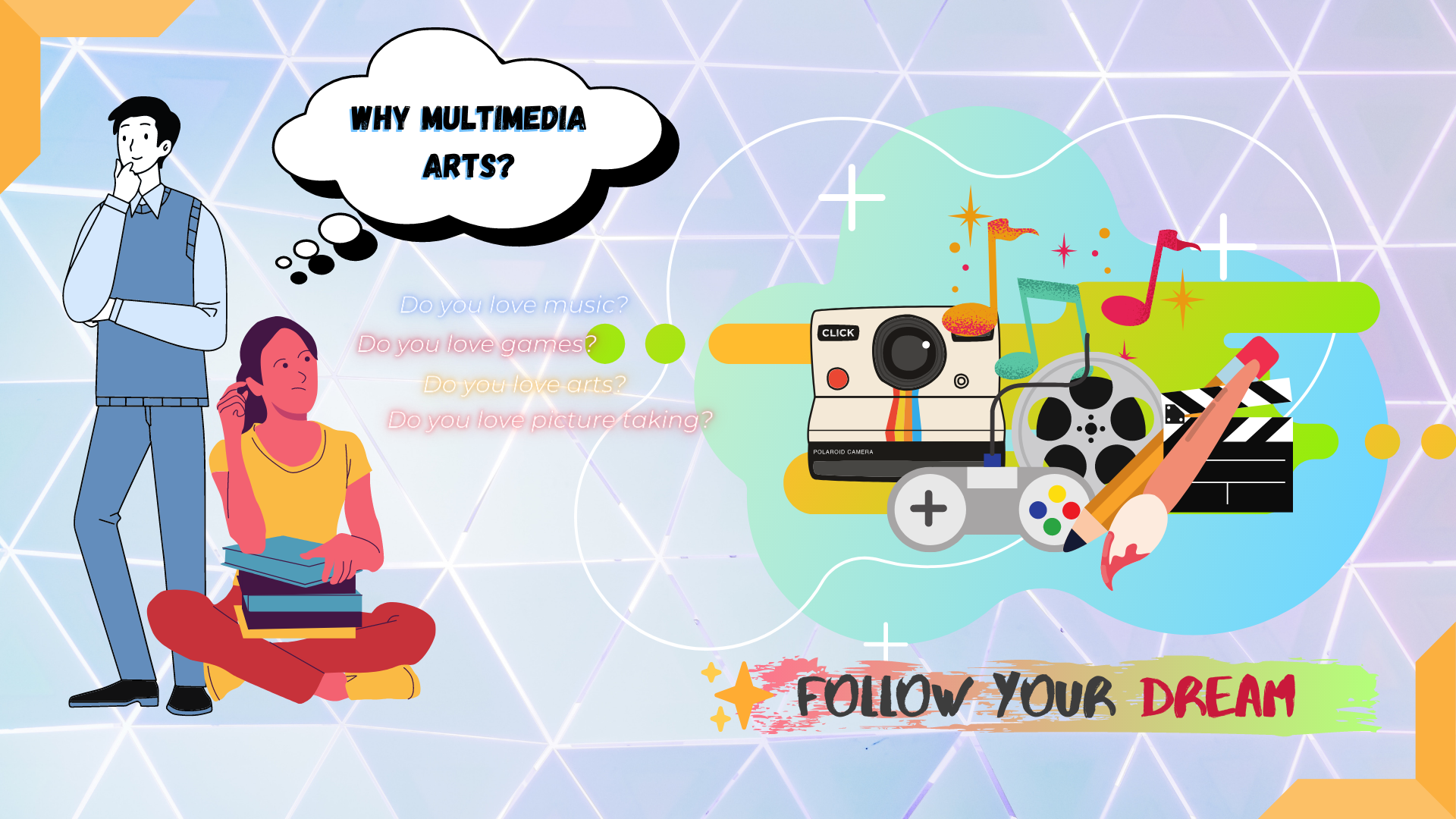
 In this illustrations I named it, Why Multimedia arts and it explains what can you do and what can you work with in Multimedia arts. I used the principles Redundancy Principle, Segmentation Principle and Coherence Principle, I used the redundancy principle wherein as you can see in the illustration I only use a few text and use more visual images like clip arts because based on some studies images are more easy to remember and process in the brain rather than text, in the left side and it explains what can you do and what can you work with when you enter multimedia arts. I also used the segmentation principle where in I grouped the elements into 2 in the left side which are the text and in the right side which are the images so that it will look neat and organized as the viewers see it.Lastly I used the Coherence Principle where in I only used few elements so that the whole illustration will not look like cramped and the audience will clearly understand what the illustration means. Lastly the word FOLLOW YOUR DREAM is the most important and it serves as a motivation for aspiring artists.

Comments

Popular posts from this blog

WEEK 2 Poster Layout (2ND SEMESTER)

Here is my poster layout for a company GRAPHIC DESIGN. I used combination of warm and cool colors to make it balance and not too vibrant I only used 1 clipart so that will be the focus of the poster, when the audience saw this their eyes will focus directly in the only clipart because it is the only one their. The text also has a huge role in the poster in the first sight the audience that will see this will think that this poster is for designing, to get more information, they will look on the text to give them more ideas about the poster like the company name the services and most importantly the contact number and locations. I make it simple and modern so that it will caught the attention of the audience.  

Apir / High Five

  CONCEPT The concept of this photo is a sudden relationship of two group of people despite of each other's race, color, gender, age and lifestyle in order to have a certain goal and give benefit to each other. MESSAGE OF THE PHOTO The purpose of the image is to show that, people can have connections despite of age, race, differences and lifestyle. The story of the image is that the man on the right side who is a director of a film suddenly in need for child actors that will be an extra for the film they are producing. Perfect timing that there are a lot of children around the set who are watching the film. The children are willing to participate and they are enthusiastic to be part of the film. The image just tell that even thought all of us are different, if we are willing to communicate and connect with others it is really possible despite of differences and circumstances. VIDEO EXPLANATION CLICK LINK FOR VIDEO >>  VIDEO PRESENTATION

3cs Graphic Design

This is the artwork that I will submit for the 3cs Graphic Design Activity where in I used the program photoshop to create this. I chose the logo radioactive from the selection the our professor gave to us because in my own perspective this logo is not usually getting picked or included in designs, its rare to see this shape because of its characteristics and what describes it which is a danger sign. I use the radioactive shape and put a gas mask in front of it and combine it to create a unique design. The inspiration of this artwork is to look back on the history on what happen on Chernobyl on that day. I used simple white background so that the logo in the center will be more emphasize and will be noticed immediately. I used simple fonts and typography so that the main element of the artwork which is the shape in the middle will be the center of attention. Lastly I created this artwork using photoshop and from the photo editing tutorial I learned in my class I able to put realistic p...